Saturday, June 6, 2009

Vintage Fluffles

I'm almost positive I made this card based on one from Sharon Johnson's blog . . . but I can't find it anywhere! I remember it was a sketch challenge, and that the three embellishments arranged vertically along the bottom right edge was part of the sketch, along with the overall layout, but I am not sure of the who or where or when; I just know I loved the sketch and found it very fun to work with!Using a double-sided patterned cardstock, and coordinating solid cardstocks from Stampin Up's 2006 In Colours made this card really easy and relaxing to create. I received the stamped Fluffles image in an image RAK -- so sweet! I cut the image out using my oval Coluzzle template, and after colouring it with my Prismacolor pencil crayons, and gently sponging Brushed Corduroy Distress Ink around the egdes to soften the starkness of the white cardstock the focal image is stamped on, I layered that onto a scalloped oval punched out of white cardstock. If you look closely, you can see that I coloured around the insides of the scallops with a light blue Prisma, to keep in the theme of the overall look of the card.

I always place the card elements together first without gluing them down, and when I did that with this card, I realised sponging the edges of ALL the layers would tie everything together really well -- I think this is the first time I've tried that, and just love the results. I also did a little rough rubbing of the inkpad around the edges of the patterned paper layer, and made the Buckaroo Blue card base recede a little by stamping a small flower from a Studio G clear stamp set in Frost White pigment ink randomly all over it.

Paper: Stampin Up solid cardstock (Buckaroo Blue, Vintage Violet), white cardstock (Domtar), double-sided patterned cardstock.

Stamps: Stampendous Fluffles and snail, "hello" by Inkadinkado

Ink: Brushed Corduroy Ranger Distress Ink, black, Frost White by Colorbox

Other: Giga scallop punch by Marvy, Threading Water border punch by Fiskars, Prismacolor pencil crayons, ribbon by Offray, sponge by Royal & Langnickel, foam dimensionals.

Thursday, June 4, 2009

Warped words

I saw this phrase on a tshirt online, and instantly had this card idea. Finally got around to doing it last week, and here it is. :) It was a lot of fun, and a great "excuse" to use things I tend to hoard, like the large eyelets by ProvoCraft, and the silver metallic Bazzill cardstock.


After stamping the sentiment in black using a Studio G photopolymer alpha, I crumpled the silver cardstock by lightly misting the back of it with water and wadding it gently into a loose ball. After uncrumpling the paper, I added some strategic folds wherever I felt like to add more depth and visual interest to the light crumpled look. It didn't take long for the cardstock to dry; I might have hit it with my heat gun, but also might not have. Once it was dry, though, I rubbed Brushed Corduroy Distress Ink lightly over top the silver cs, mostly to highlight the fold lines. After that, I rubbed Tattered Rose Distress Ink a little more firmly over top to add some subtler "lowlights" (to borrow a term from hair colouring-ese). Sounds kinda nutso, but the pale pink tones work really well in this application; I've done it in the past with other projects and love the effect.

The silver cs is matted onto brown cs spritzed with Memories Mist in Espresso, then mounted onto some light grey Bazzill Smoothies cardstock that I stamped with some funky geometric shapes by Inkadinkado. I ran a black Brilliance dewdrop along the edges of the card layer to increase its visual weight; it really enhanced the look of the card, and helped balance the visual weight of the textured silver cs.

Sunday, May 31, 2009

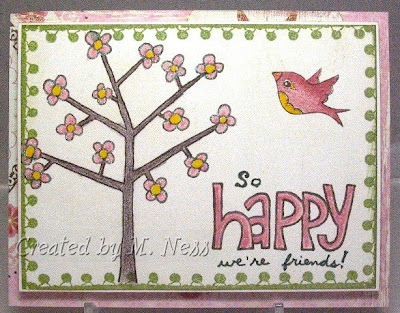
Happy We're Friends

I've been making most of my cards lately using the "Out & About" 12x12 glittered paper collection by My Mind's Eye, partially because I love the paper, but mostly because it's been easily accessible on my craft table. :) Plus, I have the coordinating Prismacolor pencil crayons set aside and handy, so it's been easy to stamp and go to town. :)

I started out simply stamping the tree (from the May 2009 Unity KOM) going just a titch off the edge of a 4.25 x 5.5 piece of white cardstock. The white was a little stark in contrast with the patterned paper I wanted to use, so I sponged some Brushed Corduroy Distress Ink over it to tone it down a bit. After I coloured the tree in, I trimmed the white focal layer down as small as I could while still fitting the tree on, and completed the scene with the bird (Unity November 2008 KOM) and "happy" (Unity May 2009 KOM).

The tree scene needed to be beefed up a bit for the card design to work for me, so I framed it with the pompom edging stamp by Inkadinkado in Bamboo Leaves by Memento. Layered that on a fine white cardstock matting, and adhered it to the glittery pink cardstock using foam mounts for dimension. I happened to come across my glue pen, and thought to myself I might as well use it and some glitter, so made the pink flower petals *pop* with some white glitter I got from the dollar store. I totally love the effect IRL, but it's been hard to get a photo that does it justice.

Monday, January 12, 2009

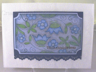
First card, photo, and post of the New Year!

Guess what I got for Christmas? A light tent with fancy tungsten lamps and a telescoping camera tripod! This is the first anything crafty that I've made this year, so it's also got the honour of being my first photo subject. :) I've got a lot to learn about how best to use my equipment, but I'm quite happy with how the details show up below.

Stamps: Weathered backgrounder by Cornish Heritage Farms, small fern and flowers by K&Co., Simply Stated floral and swirly designs by Fancy Pants, sentiment by Inkadinkado.
Inks: Chestnut Roan and Alabaster fluid chalk inks by Clearsnap, Colonial Blue Versamagic chalk ink by Tsukineko, Versamark.
Papers: ProvoCraft designer cardstock, vellum 5x7 card base by Halcraft
Tools: Prismacolor pencil crayons, Prismacolor colourless blender, ticket corner punch by EK Success, sunburst border punch by Fiskars

I started off the whole card by deciding to use these vellum cards I picked up from the clearance section in Michaels a few years ago. Well, actually, I decided I wanted to use one of the vellum envelopes the card bases came with first, then when I realised the envies came with matching cards I used one of those. :) I stamped the front of the card base repeatedly using a small swirly fern image in the Alabaster ink, and chose to mat my focal image in a darker blue cardstock so you can see the fern stamps clearly against it when the card is open. And because this card was all about having fun (in contrast to the mad dash of Christmas card season) I used my favourite Simply Stated stamp set (love those beautiful flowers!).

I don't have too much else more to say, except I'm a bit tired and "written out", so to speak. I got back in touch with a whole bunch of old friends thanks to the wonders of Facebook, and we have had a lot to catch up on. :) However, I miss stamping and writing the little bit I do about this fun hobby with no pressure or stress, so I am happy to be here taking a bit of a breather!

Monday, December 8, 2008

Christmas Fruitcake

I'd wanted this paper collection by Basic Grey called "Fruitcake" for *forever*, a few years at least, and finally picked it up when I saw it on clearance at Hobby Lobby earlier this fall. I'd been wanting this paper for forever, and also wanted to use it to participate in Sharon Johnson's Stamp Simply Challenge #10! (Keyword ssnotime10) I fell in love with the cards she made for that challenge, and looked forward to creating my take on them. :) So here they are!!
For this challenge, we had to let the patterned paper do the work for us, and were limited to using only sentiment rubber stamps. I chose to computer-generate my sentiment, so I didn't pull out my stamps at all for these cards! The only "stampy" thing I did was use my Frayed Burlap Distress Ink pad by Ranger to distress the sentiment cardstock and get it to blend in better with the patterned paper.
These cards were totally awesome to make, because:
  • they went together very quickly
  • I happened to have some perfectly-coordinating cardstock and ribbon that I received in a surprise box from The Angel Company that I had been hoarding up til this point -- double points for both the perfectly coordinating AND the use of hoarded items!
  • I loved using the pewter tree brads by some of the sentiments!
Part of what let this set of cards come together so quickly is my habit of making up the fussier things six at a time. I spent some time choosing the style and colour of the sentiments and then printed out six at once and brought them to my crafting table. Once that was out of the way, I was free to carry on with the serious business of cardmaking with everything I needed right in front of me!

Ink:
Frayed Burlap Ranger Distress Ink
Papers: patterned paper from the Basic Grey "Fruitcake"collection, confetti blue-green cardstock from TAC
Other:
taffeta ribbon from Making Memories, pewter tree brads from Paper Salon Spare Parts

Saturday, December 6, 2008

Emerald Christmas

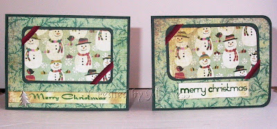
I had some lovely emerald green holiday scrapbook paper I picked up from the dollar bins in Jo-Ann Fabrics last year -- I was so tickled to find it complimented my ruby-coloured houses! I didn't think ruby on emerald on emerald would work out quite so well, so instead I went with a tricolour colour scheme of emerald, ruby, and that dark chocolate brown again. (It was still out on my craft table from the ruby cards I posted about yesterday.) I also used white and pale grey, as you can see. The card on the left was inspired by a wonderful Christmas card I saw on Tobi Crawford's blog here. The other card design came about because I wasn't totally happy with just centring the scalloped oval on the green layer, and decided to see how breaking up the large space with a sheer ribbon would look. I quite liked it, so it stayed. :)

Stamps:
house, snowflakes, and sentiment from Martha Stewart gingerbread men stamp set

Inks:
Rhubarb Stalk, London Fog, and Rich Cocoa Memento dye inks Papers: green patterned paper by Colorbok (Jo-Ann dollar bins), grey, brown, and white cardstocks

Papers:
patterned paper by Colorbok, white, grey, and brown cardstocks

Other:
green double-faced satin ribbon with silver trim by American Crafts, sheer ribbon with sparkly trim by Offray, ticket corner rounder punch by EK Success, decorative-edged scissors by ProvoCraft (don't get PC d-e scissors; Fiskars are WAY better!), white snowflake brads by Paper Salon

Sheldon and I decided to decorate just the living room because the office is pretty full as it is. So now when we go to the kitchen to get our coffee or meals, or go do laundry, we get treated to our festive and pretty living room!

Ruby Christmas

I saw these wonderful little houses on the Martha Stewart Christmas line and fell in love with them -- I think they have such personality and are so unique! Luckily for me, three houses in this style were available in the MS Gingerbread men stamp set! I think I'll get good use from them year-round, not just at Christmastime.
When I sat down to make these cards, I knew I wanted to use:
  1. my Giga scalloped oval punch
  2. one of the houses from the MS gingerbread men stamp set
  3. some of the ribbon in the American Crafts Christmas set I picked up at Hobby Lobby on clearance a few years ago
  4. my new Memento dewdrop inkpads
Other than that, I had no clear plan, so it took me FOREVER to make the first card. I started out by stamping the house on white cardstock and punching it out, but quickly found it was much easier for me to punch first and then stamp my image centred in the oval. So, I created several focal images (about a half dozen) so I could move on to the card design; this also let me use some of the less-perfect stamped ovals to test the results of inking, sponging, etc before I committed to using a technique or product on the card itself.

After much trial, error, and gnashing of teeth, I finally made a card I was REALLY happy with using SCS Card Sketch #201 as my starting point. I worked on that first card for an entire evening before leaving it unfinished and going to bed. Then the next morning, I assembled it in fifteen minutes, then made a second identical card in ten minutes flat! The second card is on the left in the topmost photo -- you can see I went a little haywire with sponging on the walnut stain ink on the mat for the focal image. :) The design choices I made to get this card to "work" were:
  • go with a monochromatic colour scheme
  • sponge my neutral colour (in this case, a chocolatey brown) over the patterned paper and on the white cardstock to reduce contrast and thus let the focal image take centre stage
  • sponge the edges of the card base with my neutral colour to unify the cardstock base and the patterned paper attached to it, and frame the focal point of the card
  • go with clean lines to balance the scalloped shape and richly patterned paper
  • use the complementary colour to accent around my focal layer and give it more visual weight
Stamps: house and snowflakes from Martha Stewart gingerbread men stamp set
Inks: Rhubarb Stalk, Bamboo Leaves, and Rich Cocoa dye inks by Memento, Walnut Stain Distress Ink by Ranger
Papers: "Devotion" patterned paper from Basic Grey Blush collection, Cherry Bazzill Smoothies cardstock, white cardstock by Domtar, brown cardstock from Hobby Lobby open stock, so probably by Paper Salon
Other: paper edge distresser by Heidi Swapp, black antiqued mini brads, silver-edged double-faced satin ribbon by American Crafts, Giga scalloped oval punch by Marvy

Because I had made several of the houses on scalloped ovals the previous night, it was very easy for me to continue playing around with making another card using the supplies I already had out. :) For this next card, I used the same Cherry card base, chocolate brown cardstock, and focal image, but this time incorporated some American Crafts Christmas rub-ons I'd picked up last year.
I found I liked this little house image best when it is set against patterns more than when it is against a plainer background. I wound up stamping the grey layer with a "Season's Greetings" script stamp from an MSE holiday sentiments set in Versamark. The card base is stamped with paisley images in Moonlight White ink.

Here's a closeup of the stamped grey cardstock. Don't tell anybody, but I glued the grey cardstock onto the brown upside-down... the "Season's greetings" script is facing the wrong way! But, it still fills the design role I needed it to, and it took me a while to notice this so I'm not too worried. :)

Stamps: house from Martha Stewart gingerbread men stamp set, sentiment from My Sentiments exactly
Inks: Rhubarb Stalk Memento dye ink, Versamark, Moonlight White Brilliance
Papers: Cherry Bazzill Smoothies cardstock, white cardstock by Domtar, brown cardstock from Hobby Lobby open stock, grey "True Value" cardstocks from Michaels
Other: ticket corner rounder punch by EK Success, white Gelly Roll Souffle pen, green sentiment and flourishes American Crafts rub-ons, paper piercer, Quickie glue pen, Martha Stewart yellow gold glitter

Sheldon and I will be putting up the Christmas decorations today -- woohoo! We spend SO much more time in our office/hobby room than in our living room, maybe we will decorate the office this year and leave the living room plain -- who knows!